How Does It Perform? Testing Tesla's Stalk-Free Drive Controls
Tesla’s somewhat perplexing crusade against traditional car features continues. Speedometers, handbrakes, and mirror adjusters have all been eliminated. Now, the stalks that used to protrude from the steering column in the Model 3 and the latest Model S (now LHD-only) are gone too.
Previously, one stalk controlled the indicators. Now, it's done with two buttons for your left thumb: the top one for turning left and the bottom one for turning right. It can be tricky if you haven’t signaled before turning the wheel, but you get used to it.
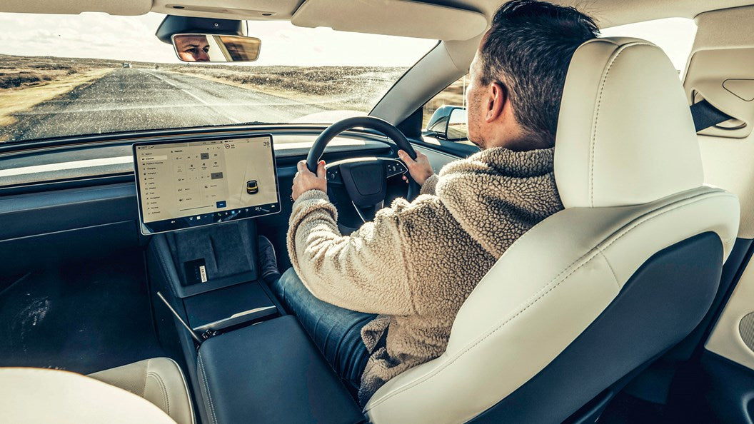
But losing the other stalk is a bigger issue. It used to control the drive selector, offering a simple choice of R, N, or D (or press it for P), all without needing to look. Now, gear selection is another touchscreen task. Press the brake pedal, and a slider appears on the screen edge. P at the top is for Park, slide up for Drive, and slide down for Reverse. There’s no dedicated N for neutral.

In our time with the latest Model 3, the new system worked just as it was intended to, with none of the screen freezes or crashes you’d fear. The problem is that you have to look at the screen to be sure you’re swiping the right bit and that it’s done what you want. Would you ever get to the stage where you’d swipe without looking? I suspect not.
It makes three-point turns slower and more irksome than a conventional eyes-off gear selector, which has to be a bad thing.
Above your head is the fallback position, in the form of physical buttons for PRND. These would be even slower if you tried to use them as an alternative to the screen – they really are only there for emergencies.
The potentially most interesting bit currently has Beta status, ie it’s still being perfected. When you opt in to ‘Auto Shift out of Park’, as it’s clumsily but accurately called, you can change gear without using either the screen or the buttons. More precisely, the car does it for you. Based on sensor data and your previous manoeuvres, it makes an educated guess about what you want to do next.
If, for instance, there’s a wall behind you, it knows you’ll want to go forwards, not back. If it’s correct – OMG THE CAR IS READING MY MIND – you just press the accelerator and go forwards. If it’s wrong, you tap the brake pedal and over-ride its gear selection.
How it works: Tesla’s stalk-free interior

Virtual gearlever
When you put your foot on the brake pedal, the right-hand edge of the screen becomes a slider that performs the functions of the old gear-selector stalk.
The swipe-free option
You can opt to go further and bypass the swipe. Instead, the car calculates whether your next move will be fore or aft, and you just need to use the pedals.

Losing the drive selector stalk is a bigger change. It used to offer a simple choice: R, N, or D (press for P), all operable by feel. The new system moves gear selection to the touchscreen. Press the brake, and a slider appears on the screen's edge. Slide up for Drive, down for Reverse, with Park at the top. There’s no specific Neutral option.


